


- Client
- Readwise
- Services
- Branding
- UI/UX Design
- Design System
- Industry
- Design, Mobile
- Stage
- Private
Designing Readwise’s first of its kind read-it-later app
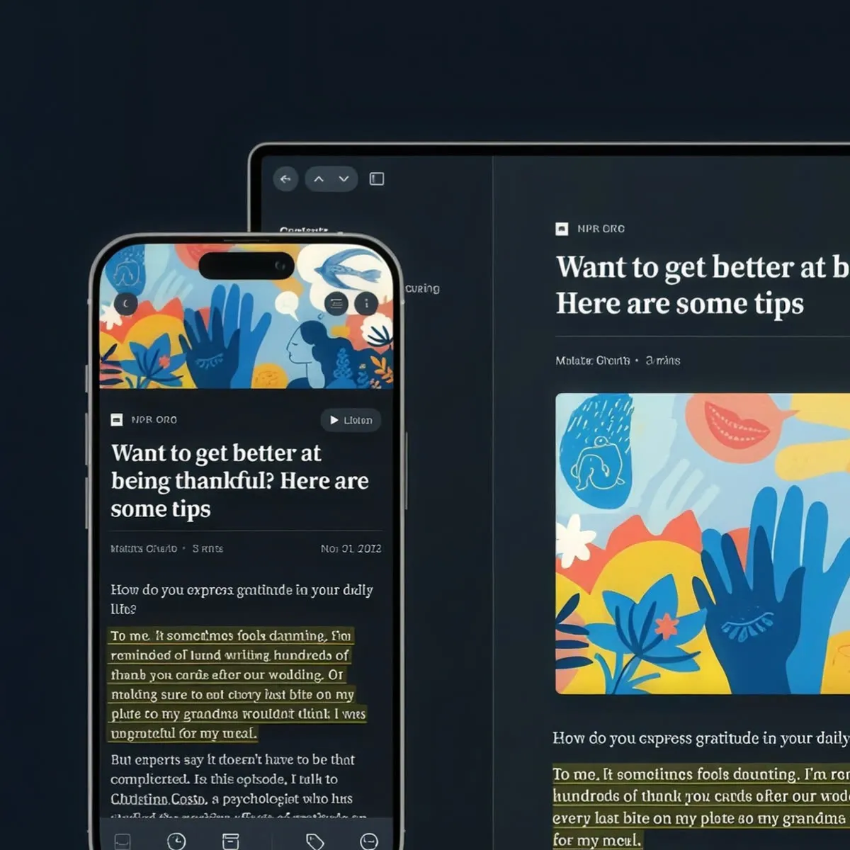
We helped Readwise design Reader, the ultimate reading app where users can save, highlight, and read everything in one place.
Our impact
Designed powerful UX flows for highlighting, searching, note-keeping, and more
Established design system foundations that their team built upon to create the full Readwise experience
Tailored our designs for both desktop reading and mobile reading experiences
Readwise is one of the fastest-growing consumer apps in the market.
Overview
They make it extremely easy to save and revisit your best highlights from Kindle, Pocket, Instapaper, iBooks, and more, either in their app or through a daily email.
The Vision
As leaders in the space, the Readwise team deeply understood that current reading apps lack the ability to accommodate modern content types and cater to their power users. They knew the problems that users face with features surrounding connectivity, performance, and highlighting, and they wanted to design the best solution possible.
Why Lazer?
Readwise approached Lazer because of our experience designing intuitive desktop and mobile apps, with a focus on user experience and conversions.
approach
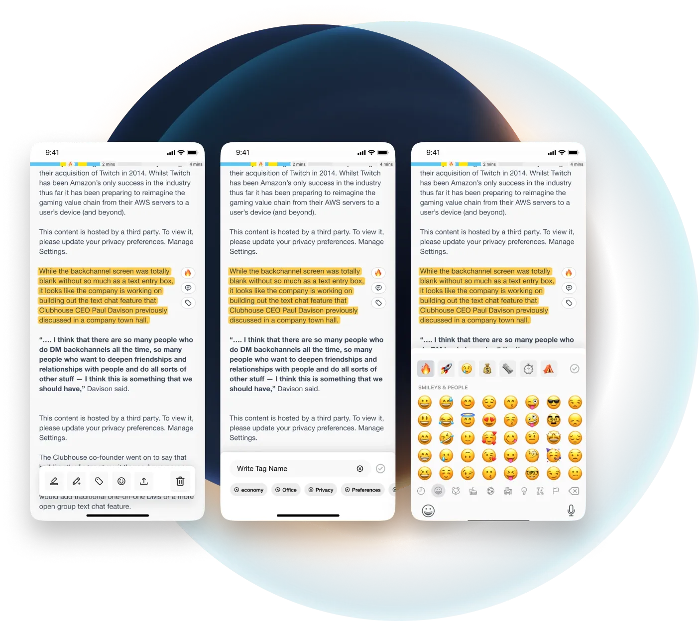
Understanding user pain points
Readwise founders Tristan Homsi and Daniel Doyon are some of the most thoughtful founders we’ve encountered.
Immediately upon working together, it was clear they understood the pain points readers were experiencing and what needed to be done. We worked closely together to design the best read-it-later app to streamline all reading in one place.
approach
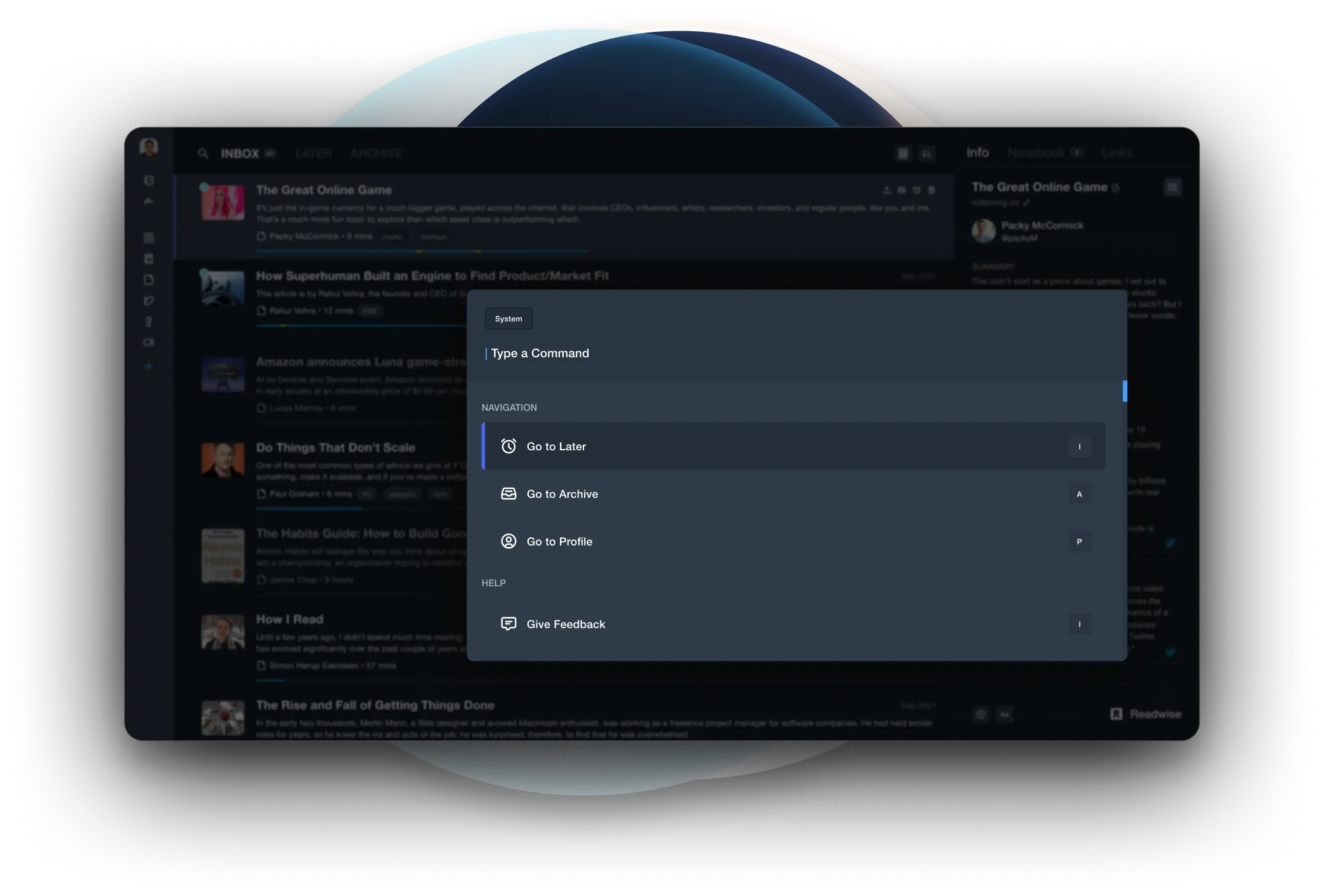
Redefining powerful UX flows
Knowing the challenges that users had with other reader apps was key to creating the best possible experience for them.
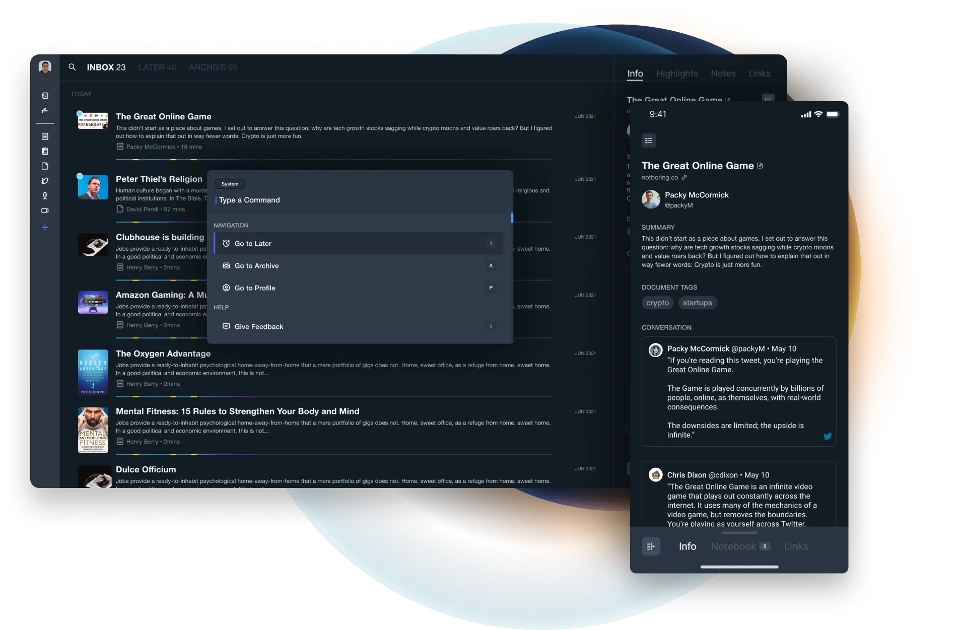
We spent a great amount of time and detail crafting powerful UX flows for highlighting sequences, command panels, searching, note-keeping, and more.
approach
Foundations for the design system
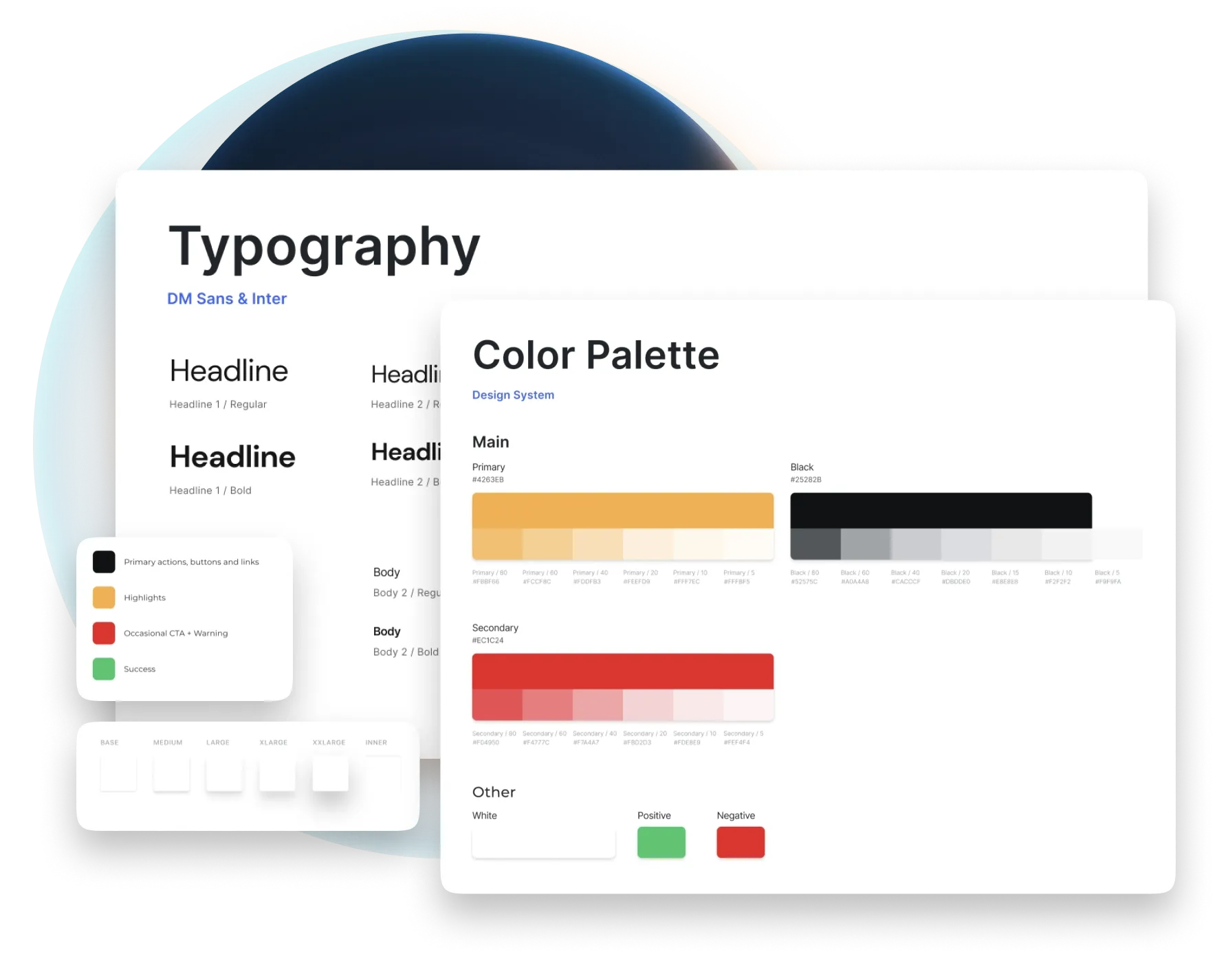
As an initial effort, we established the foundations of a design system. The Readwise team then took these foundations and continued to build and improve upon them.
We explored and designed beautiful elements that would serve as building blocks for the Readwise experience.
This included shadows, typography, colour palettes, fonts, components, and more.
approach
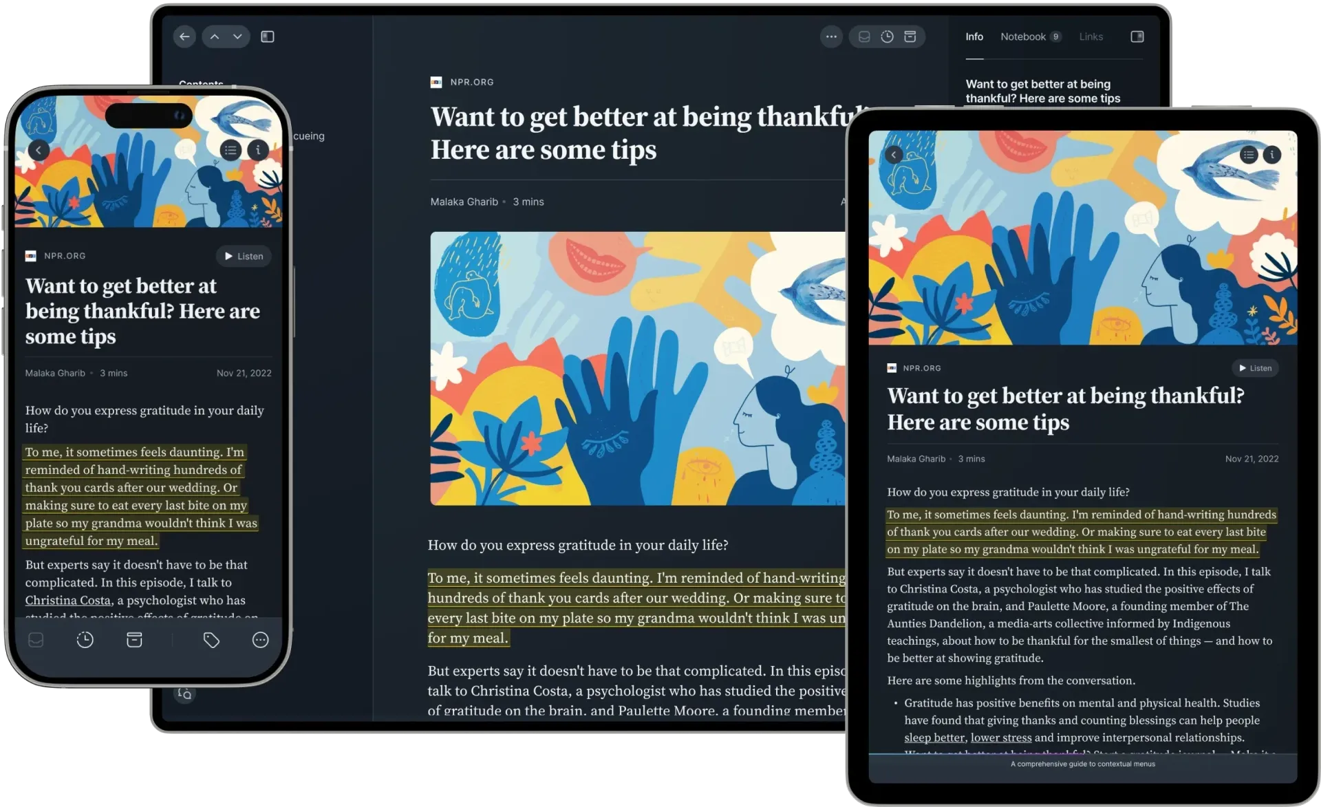
Empathy for both desktop and mobile
Mobile consumption is growing much faster than desktop consumption, especially when it comes to reading.
Understanding this, our design efforts needed to deliver the ideal user experience for mobile readers as well as desktop readers.
Conclusion
Reader launched in public beta
After 1.5 years in private beta and thousands of testers, Reader launched in public beta.
With a strong focus on UX, the design of the Reader app has been a huge success. New and existing readers love the app, and the feedback from power readers on the platform has been outstanding. We highly recommend trying it if you’re interested in replacing your many apps with one fully integrated reading app!